


Data visualization is an essential aspect of any field that involves data analysis. One of the most effective tools in this domain is the bar chart, which provides a clear, visual representation of categorical data. In this guide, we will delve deep into the world of bar charts, exploring their utility, variations, and best practices to make the most of this powerful tool.
What is a Bar Chart?
A bar chart is a type of graph that represents data with rectangular bars, where the length of each bar is proportional to the value it represents. Typically used for comparing quantities across different categories, bar charts are widely popular for their simplicity and effectiveness. The bars can be displayed either vertically or horizontally, depending on the type of data and the desired focus.
Types of Bar Charts
There are several types of bar charts, each designed to highlight data in a specific way. Let’s explore the most common variations:
1. Vertical Bar Chart
The vertical bar chart is the most widely used version, where bars stand upright, and the height of each bar corresponds to its value. This format is ideal for comparing data across different categories. Vertical bar charts are particularly effective when the number of categories is limited.
2. Horizontal Bar Chart
The horizontal bar chart flips the traditional bar chart on its side, where the length of each bar extends from left to right. Horizontal bars are useful when you have long category labels or when comparing large datasets. This format can be especially advantageous when readability is a concern, as it allows for more space to display labels.
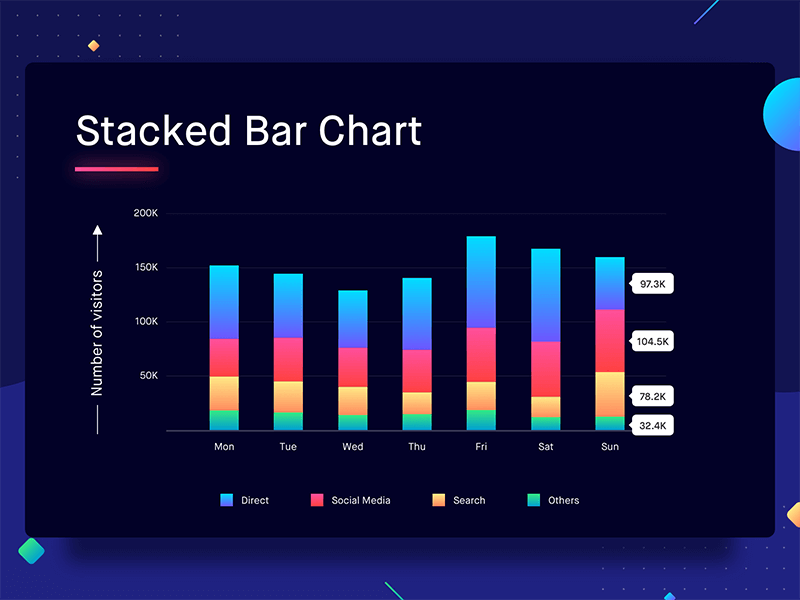
3. Stacked Bar Chart
The stacked bar chart adds another layer of complexity by stacking segments of different categories on top of each other. It allows for the visualization of both the total value and the contribution of individual parts. Stacked bar charts are perfect for showing the composition of data across multiple categories, such as breaking down sales revenue by product category and region.
4. Grouped Bar Chart
In a grouped bar chart, multiple bars are displayed side by side for each category, allowing for easy comparison between sub-categories. This format is often used when the data needs to show the relationship between two or more related variables. For example, a grouped bar chart could compare sales figures across different years for multiple product lines.
5. 100% Stacked Bar Chart
The 100% stacked bar chart is a variation of the stacked chart, but instead of showing the absolute values, each bar represents 100% of the category’s total, and the segments within the bars represent the percentage contribution of each sub-category. This is useful for showing proportional relationships within a total, such as market share across different companies.
When to Use a Bar Chart?
Understanding when to use a bar chart can significantly improve the clarity of your data presentation. Here are some key scenarios in which bar charts excel:
- Comparing categories: Bar charts are perfect for side-by-side comparisons of different groups or categories, such as sales by product type or revenue by region.
- Displaying changes over time: When combined with time-based data, bar charts can help visualize trends and patterns. Grouped bar charts are particularly useful in this case.
- Part-to-whole analysis: For visualizing how parts contribute to a whole, stacked bar charts (or 100% stacked bar charts) are highly effective.
- Ranking data: Bar charts are excellent for ranking data points from highest to lowest, making it easier to identify top performers or areas that need improvement.
Best Practices for Designing Effective Bar Charts
While bar charts are relatively simple to create, adhering to best practices ensures that your data is communicated clearly and accurately. Below are some key recommendations for designing effective bar charts:
1. Choose the Right Bar Type
Selecting the right type of bar chart is crucial. For straightforward comparisons, use vertical or horizontal bars. If you need to show relationships within a category, stacked or grouped bar charts are more appropriate.
2. Consistent Bar Width
Ensure that all bars have consistent widths to avoid misleading the viewer. Inconsistent bar widths can distort the data and lead to misinterpretation.
3. Label Clearly
Bar charts should always be clearly labeled. This includes the axis labels, category names, and values where appropriate. Avoid cluttering the chart with excessive labels, but make sure all necessary information is included.
4. Use Colors Wisely
When dealing with multiple categories or segments, using different colors helps differentiate between them. However, use color sparingly and make sure that the colors are intuitive and accessible to colorblind viewers. For instance, it’s common to use contrasting colors for stacked bar charts to differentiate between segments.
5. Start the Y-Axis at Zero
For accurate comparisons, the Y-axis (or X-axis in a horizontal chart) should always start at zero. Failing to do this can exaggerate differences between categories and mislead viewers.
6. Avoid 3D Effects
Although 3D bar charts may look more visually striking, they often distort data, making it harder to read accurately. Stick to two-dimensional designs to ensure clarity.
7. Keep It Simple
While it may be tempting to add excessive detail, simplicity is key in bar chart design. Focus on the data, remove unnecessary elements, and keep the chart clean and easy to understand.
Common Mistakes to Avoid with Bar Charts
Even experienced data analysts can fall into common pitfalls when creating bar charts. Here are some mistakes to watch out for:
1. Overloading with Too Many Categories
Displaying too many categories on a single chart can make it cluttered and difficult to read. Instead, consider grouping categories or breaking the chart into multiple smaller charts.
2. Inappropriate Scaling
Incorrect scaling can lead to misinterpretation of data. Ensure that the chart’s scale accurately represents the values, and avoid distortions that might lead to skewed conclusions.
3. Focusing on Style Over Substance
While it’s important for a bar chart to look good, never sacrifice clarity for aesthetics. A visually appealing chart is only useful if it accurately conveys the data.
4. Inconsistent Ordering
Bars should be ordered logically, whether by value (ascending or descending) or by a natural progression (e.g., time periods). Inconsistent ordering can confuse the audience.
Conclusion
The bar chart is a versatile and powerful tool for data visualization, capable of effectively conveying complex data in a simple and understandable format. By choosing the right type of bar chart, following best practices, and avoiding common mistakes, you can create charts that not only present data clearly but also make a lasting impact on your audience.
To explore more ways to improve your data visualization and optimize your website’s SEO, make sure to keep honing your charting skills and refining your content.